Creating a Modern and Tech-Friendly Website for Carleton
Carleton is a leading provider of compliant financial solutions and support services for the consumer lending industry. Their solutions include a suite of configurable calculation APIs that integrate seamlessly within their clients’ platforms.
If you’re thinking, “What does all this mean exactly?”, we were right there with you. The services they provide are certainly complicated, and that’s in part why they needed our help redeveloping their website. They wanted to communicate their solutions more clearly and concisely while also enhancing the look of the site to be modern and cutting-edge, like the financial solutions they provide. We set out to do this through the site structure, content organization, and overall design.
Positioning Their Core Solutions Center Stage
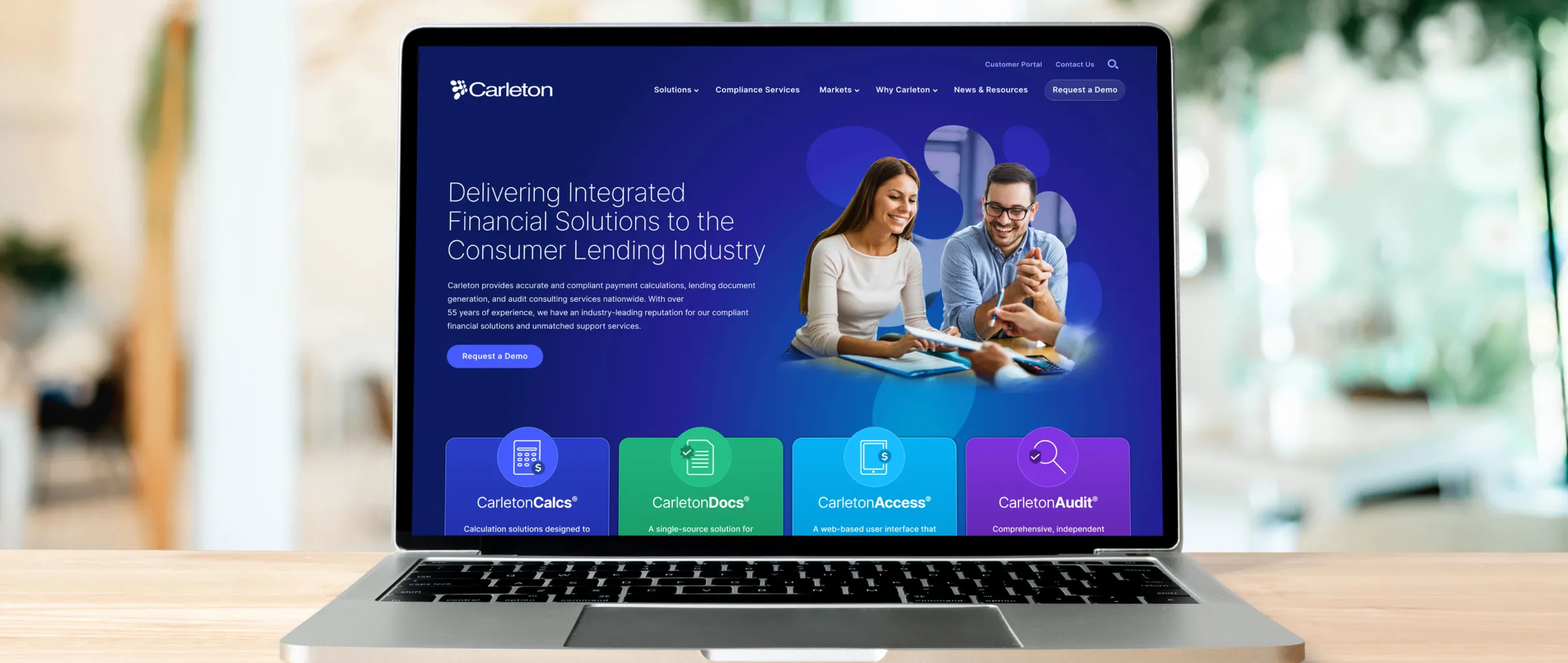
When auditing their existing website, we noticed they incorporated links to their four core solutions at the top of the home page, but only as an icon and title—nothing explained what each solution does.
Using custom icons and a unique accent color for each of their core solutions—CarletonCalcs®, CarletonDocs®, CarletonAccess®, and CarletonAudit®—we were able to help users visually distinguish between the four solutions whenever they are referenced across the site.
We positioned the solutions across the top of the home page and incorporated a one-sentence description for each so users can be more informed before choosing to click deeper and learn more.
We also designed an actionable flowchart graphic that details where Carleton’s solutions integrate within the consumer lending process. This allows potential clients to clearly see the full picture and the various ways Carleton can help within the process.
Every Page Is One Click (or Tap) Away
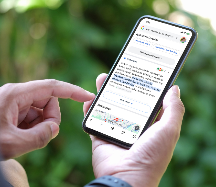
CarCalcs™ Suite, one of their primary payment calculation APIs, was buried on their existing site—requiring a minimum of three clicks to reach the page. To solve this, we designed and built a complex dropdown menu that gives users the ability to reach every page of the site with a single click (or tap on mobile).
We also made the navigation “sticky” to the top of the page when scrolling up, which keeps it easily accessible without requiring users to scroll all the way to the top of the page.
Creating a detailed dropdown menu requires thoughtful organization and UI design to ensure a user-friendly experience that’s not overly complicated, so users can clearly find what they are looking for. We were able to do this by incorporating the icons and colors we’d established for each of the core solutions, as well as type hierarchy and significant spacing.

Eliminating Friction
In order to create an actionable website, it’s important to make it frictionless. You can do this by:
-
Organizing content in a way that is intuitive—making it as easy as possible for users to find what they are looking for
-
Incorporating information that removes hesitation and helps users make a decision—presented in a way that is clear and concise so it’s easy to understand
-
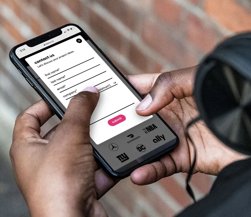
Making it easy for users to take action—whether that’s filling out a form, making a call, adding to a cart, etc.
Carleton has a great reputation in the industry, but it’s one thing for them to say it and another when it comes directly from a client. When designing the site, we included client testimonials and credible stats throughout to help build trust among potential new clients. Adding this content directly on the home page and other high-traffic pages helps eliminate hesitation right out of the gate for those who are unfamiliar with Carleton’s services.

On the News and Resources page, we added the ability for users to search by keyword and filter by article type so they can easily find the information that interests them.
By strategically placing “Request a Demo” buttons in the main navigation and throughout the body of every page, users can take action whenever they are ready from any page on the site.
A Modern, Tech-Friendly Design
With the website structure and content organization established, we focused on the visuals. We chose a clean, modern, lightweight, rounded sans-serif font for large headlines and paired it with a slightly thicker weight for the body copy to add separation and increase legibility at smaller sizes.
We used a bold blue gradient—Carleton’s primary brand color—for the hero background and paired it with vibrant accent colors that represent each core solution. We then contrasted the vibrant, bold colors with plenty of white space to break up sections and keep things looking clean.
By playing with elements often seen in modern tech software—such as overlapping shapes, transparency, and a glass effect—we worked to create a cutting-edge tech feel.

The new website launched this week, and as with any website launch, we’re excited to share our team’s passion and hard work with the rest of the world—but most importantly, to watch it generate real business results for Carleton.