3 Ways to Boost Website Conversions
Do you have a well-written, designed, and organized website that’s generating high-volume traffic, but it’s still not converting? The solution may not be as complicated as you might think.
Here are a few fairly simple things you may want to try that have been proven to boost conversions by as much as 10% or more.
1. Add a Pop-In Form
For service-based companies where conversions are measured by quality leads generated through form submissions—whether that’s a general contact form, demo request, or inquiry—simply incorporating attention-grabbing links in the navigation, page content, or footer may not be enough, because it still requires a click to reach the form. Try reducing friction by placing the form right in front of users—either embedded inline within every page, or better yet, as a subtle, well-timed pop-in.
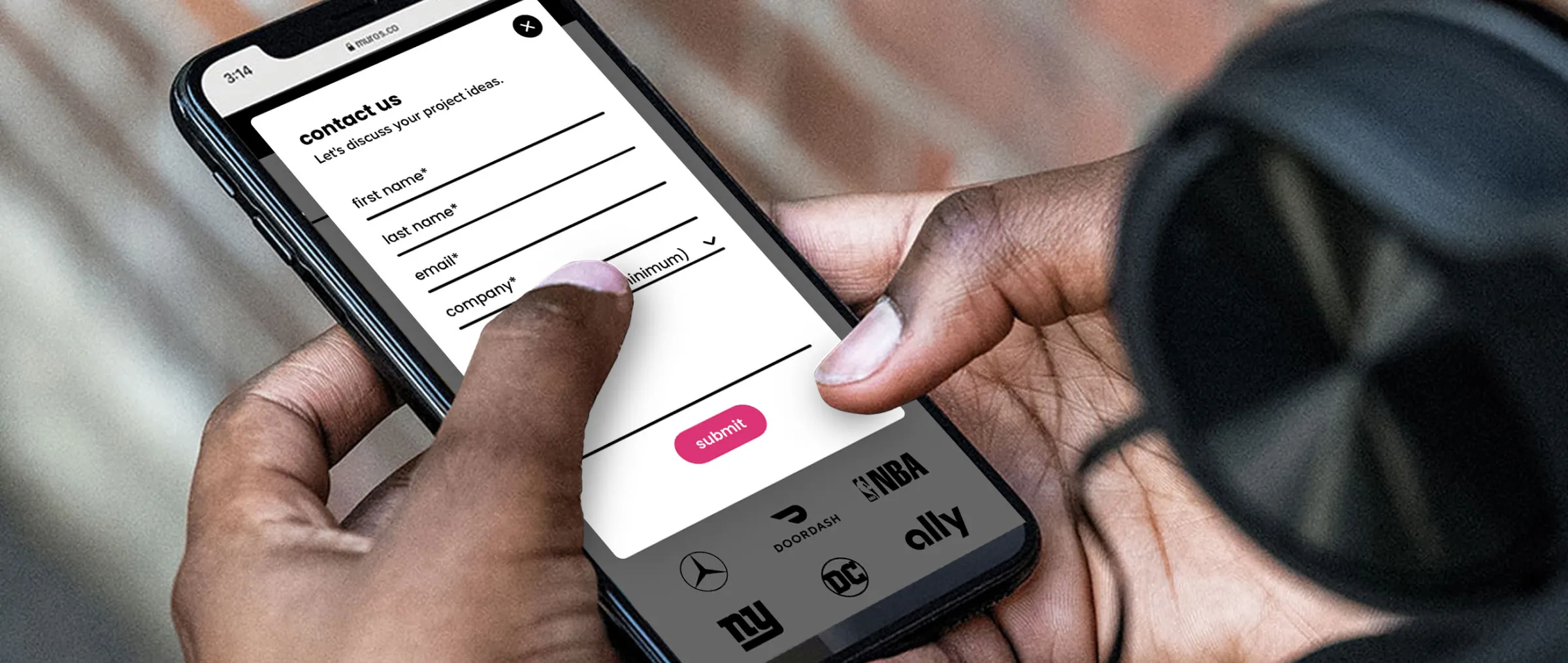
What’s a ‘pop-in’?
A ‘pop-in’ is a small box that contains the form and overlays the page content. Typically, it slides in on the lower corner of a website (or center on mobile), so it doesn’t interfere with the content on the page. It then has an easy way for users to close or collapse it, in case they aren’t interested. The simple motion of the form entering grabs a user’s attention, and puts it directly in front of them without requiring a click.
When to trigger it
The pop-in can be triggered in several different ways, but we often recommend triggering it on scroll of about 50-75% down the page, rather than immediately upon entering the site. This allows users to view a good amount of your content before it appears, which means they are generally more ready to take action.
Another option is to trigger a pop-in upon a user’s intent to exit the site. So when a user moves their mouse towards the ‘X’ to close the browser tab, the pop-in appears—often with a ‘wait!’ or ‘before you go’ message, along with the form. This serves as a final opportunity to get a conversion before they leave.
We recently added pop-in forms, on scroll and on exit intent, to our client’s website, muros.com. Since adding them, they have seen positive results, with a 33% increase in form submissions.
2. Incorporate Numerical Proof
If you’re selling a product online, especially one with a high price-point, it’s important to establish a buyer’s trust right out of the gate. Yes, sharing product benefits and your brand story is necessary, but it shouldn’t be first.
You likely already have customer reviews to prove credibility, which is a great way to show that other buyers trust your product—but that requires asking people to believe the reviews are true. With so many paid or sponsored reviews out there, especially on social media, it becomes tricky for buyers to simply ‘take their word for it’.
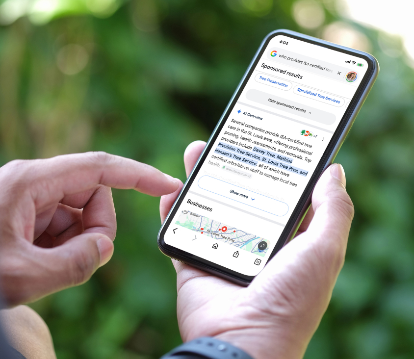
Research shows the fastest way to build trust isn’t through claims, it’s numbers.
Try leading with a compelling stat on your home page, potentially as a simple banner across the top, that proves people trust your product. It could be a differentiator like, ‘#1 best-selling product in the industry’ or a customer count, ‘over 200,000+ happy customers’. By including concrete, verifiable numbers, it provides buyers with quantifiable proof that the product works—instantly reducing hesitation.

According to Convrrt, headlines that contain numbers have a 36% higher click-through rate. And Blue Stout saw a 12.4% lift in conversions for one client after adding a customer count to the top of their home page.
3. Simplify The Page
If you offer several services or products, it can be overwhelming if you present a user with too many options at once. Everything on the page competes for attention and it can slow down their decision-making, or worse, they don’t select anything because they aren’t sure which is the right choice. By simplifying the page, it removes unnecessary distractions which allows calls-to-action to stand out.
Fewer Per Row
Try simplifying their options by showing fewer products or services per row (ex. 3 instead of 4) to help speed up their decision-making process. With fewer items competing for attention, it’s easier for customers to compare. Blue Stout shares one example where reducing the grid from 4 to 3 resulted in a 10.4% lift in conversions.

Break It Into Steps
Another way to help simplify options is by breaking them up into steps. For example, incorporate a step-by-step interactive questionnaire where a user answers questions and it leads them to a set of recommended products or services that best suits their needs.
If you sell a single product that can come in several variations, try creating a step-by-step experience like we did for our client, Pecos Outdoor. We helped them sell their high-end outdoor workstation, by creating an interactive build tool where customers explore options step-by-step, and watch their selections come to life in real time before adding it to their cart. Adding this tool helped streamline the buyer’s journey, and enabled them to buy a product that feels customized. The website redesign ultimately led to a 35% increase in conversion rate.

A/B testing is always a great way to compare and see the direct impact of your changes. Unsure where to start? We’re always here to help with the implementation or to provide recommendations. If you’re looking for a website partner, give us a shout.