A New Era for Our Site: What’s Changed (and Why)
We’ve. Been. Busy. Not only working on various client projects, but also working on a website refresh of our own. Most creatives understand that internal work is not easy to fit into your schedule, but it is so important for your business.
“Building your personal brand or your company’s brand is the most important thing in business.” – Gary Vaynerchuk
Why is that? Why should you revisit your website every few years? Well, for us, our team had changed, our work had changed, and our goals had changed, and that wasn’t being reflected on our site.
What‘s New?
We liked our site. The simplicity of the design, how easy it was to navigate, but we wanted to flex our muscles a bit. Here are a few things we wanted to change/add.
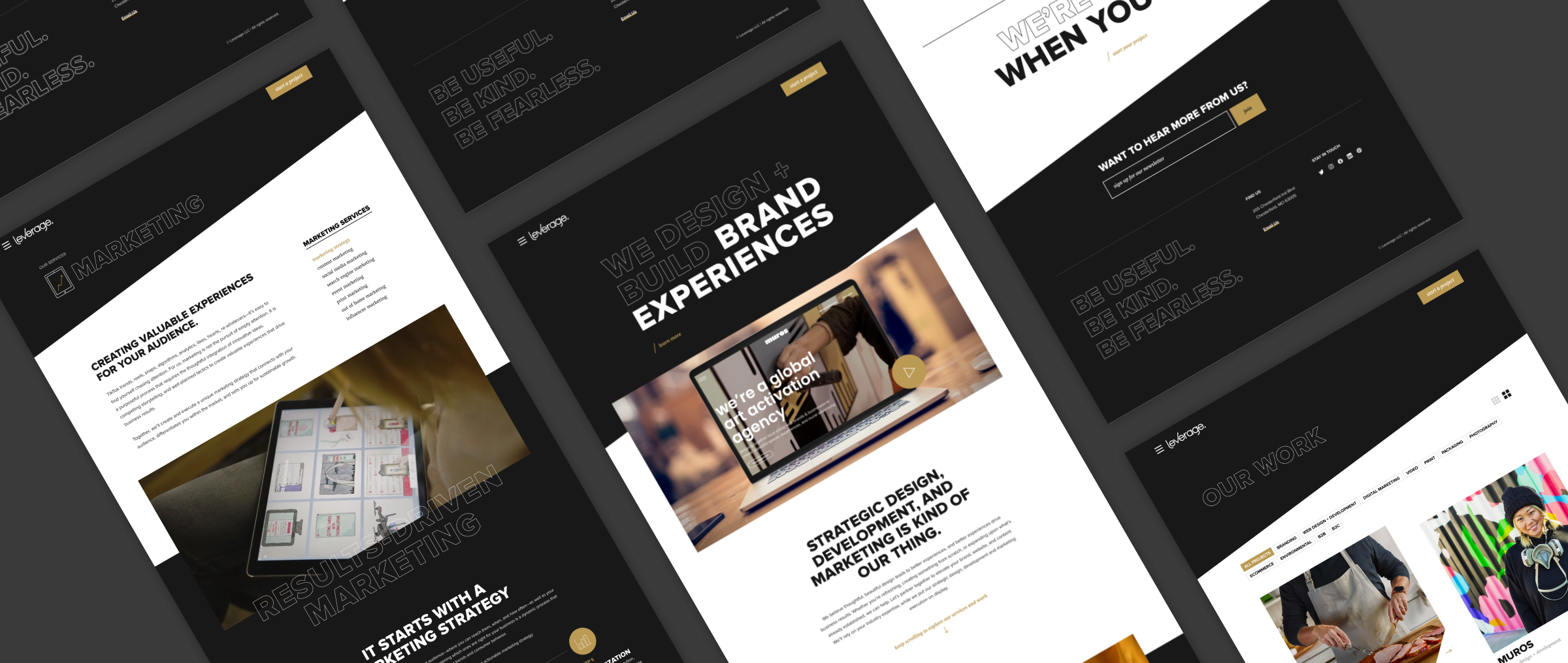
1. Fonts
We’ve always liked our fonts, but felt it was time to rethink how we were using them. We went bigger and bolder—switching our primary typeface from Merriweather to Proxima Nova. Merriweather still has a place, now used for buttons and smaller headers, instead of leading the design. We also experimented with text outlines and fills to emphasize certain words and add a sense of visual hierarchy. This change alone created a fresh, dynamic feel that changes the tone of the entire site.
2. Animation
People have always told us how easy our site is to navigate—and we didn’t want to lose that. So the challenge was: how do we make it more engaging without making it more complicated?
The answer? Animation.
We added subtle motion throughout—text fill on scroll, shutter page transitions, unique hover effects—just enough to bring the experience to life while keeping everything clean and intuitive.
3. Our Work
It had been a while since we last updated our work 😬 — we know 🙈. It wasn’t just overdue for a refresh with our latest projects; we also wanted to provide a deeper dive into each one. This update isn’t just about showing off new work — it’s about giving a fuller picture of each project: more context, more process, more insight into what we actually do and how we get to the end result.
A good-looking website is great, but what really matters is the impact. That’s why we’ve added before-and-afters, results, and real stats showing how our work helped clients grow. Because at the end of the day, the work only matters if it drives the results it was meant to.
4. Our Services
We changed the way we present our services. We wanted to simplify it down to our 3 main areas — branding, websites and marketing. We then listed out all of the services we provide that fall under these main areas and included a brief overview. This allowed us to eliminate the amount of clicks needed to view information about each service, and hopefully provides a clearer understanding of our offerings.

5. Our Content/Tone
The content was a major overhaul. Our goal was to keep things clear and to the point—eliminating the fluff, as well as incorporating more of our personality. The tone is now more relaxed and conversational, reflecting the way we connect with our clients. At Leverage, we take a personal approach with our clients so we wanted to convey that with the language we used throughout. Ultimately, we want people to feel comfortable enough to reach out—no pressure, no formality, just a friendly conversation.
What’s Staying the Same?
Even though our website is getting a facelift, we’re still the team you know and love. Focused on results-driven strategic design and development, and willing to do whatever we can to help you and your business.
How the Redesign Benefits You
We hope the new website serves as a point of inspiration and helps you envision what is possible.
We hope to continue turning out new and exciting work for you to enjoy for years to come.
Go on, check it out for yourself and drop a comment below to let us know what you think! We’d love your feedback.