Organic Remedies

Mo’ fun. Mo’ edge. Mo’ Dank.
Organic Remedies, a medical marijuana company with dispensaries located throughout Missouri, was anticipating the state’s legalization of recreational cannabis. They came to us for help building a brand presence and marketing their recreational cannabis brand, Mo’ Dank. They had an established logo and that was about it. We kicked things off with a brand workshop, which led to establishing the brand foundation with messaging and visuals—including a logo refresh. We then created a full marketing strategy with a custom website and social media marketing at the core.

A Logo Refresh to Match the Brand
After the brand session, we came away feeling the Mo’ Dank logo wasn’t quite right for their brand. It was not reflective of the high-quality cannabis they produce.
Playing off of their existing logo, we reworked it to represent a more professional brand—while maintaining a fun vibe. We explored several options, and landed on a bold, graffiti-style typeface, which we modified to give the mark more personality. We connected the ‘M’ and ‘D’, and tied it all together with a black outline to create a unified mark, while also adding more versatility for use at smaller sizes and different background colors.
Logo Exploration
Before
After
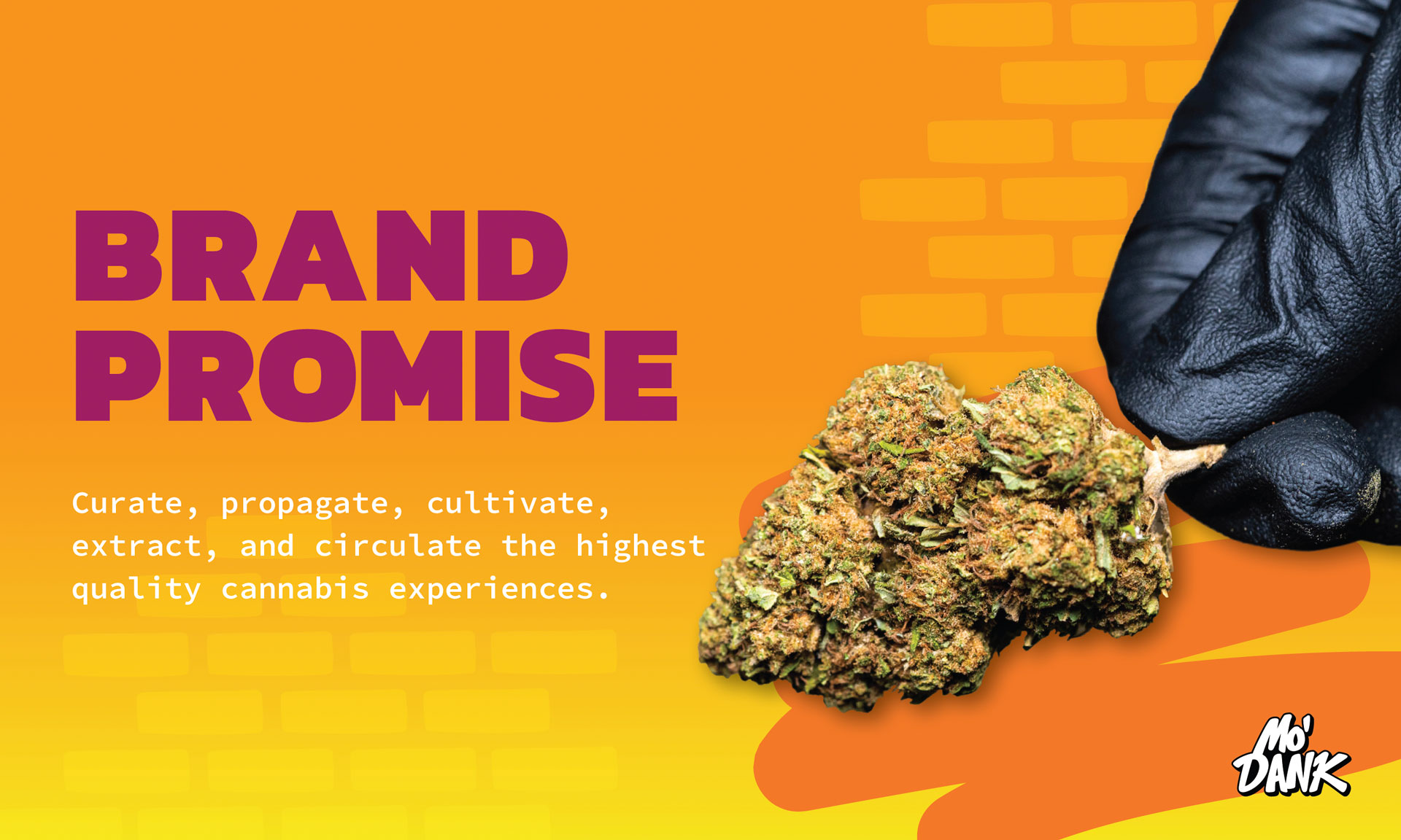
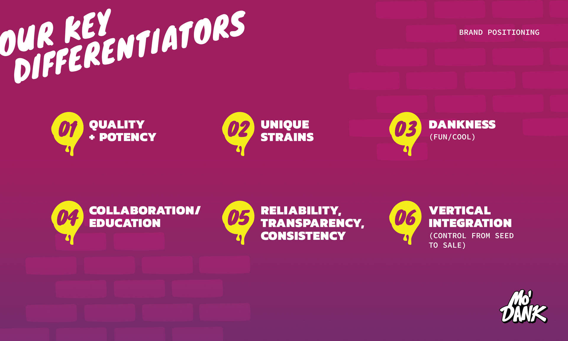
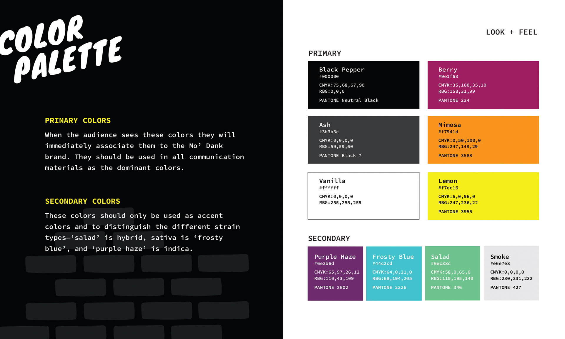
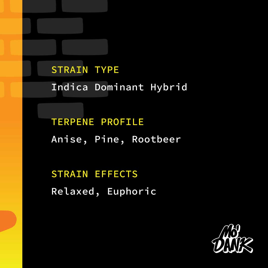
Building The Brand ‘Brick By Brick’
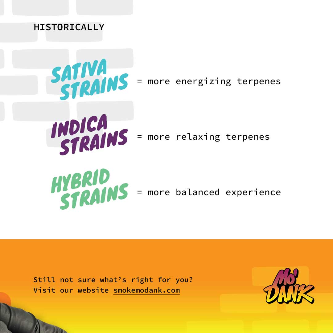
Mo’ Dank is focused on helping people be the best versions of themselves through the use of high-quality cannabis. Their personality is energetic and fun, with a slight edge.
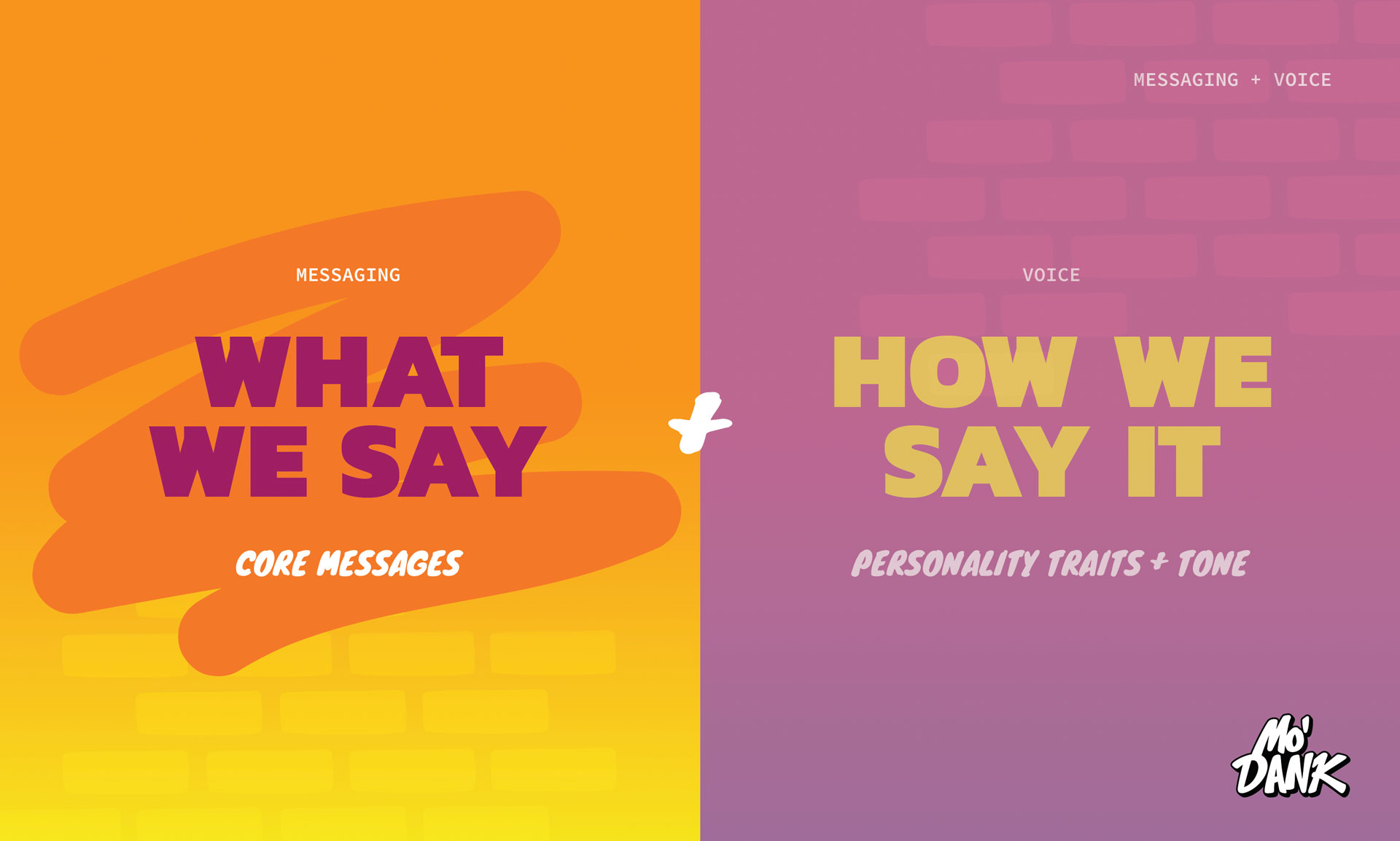
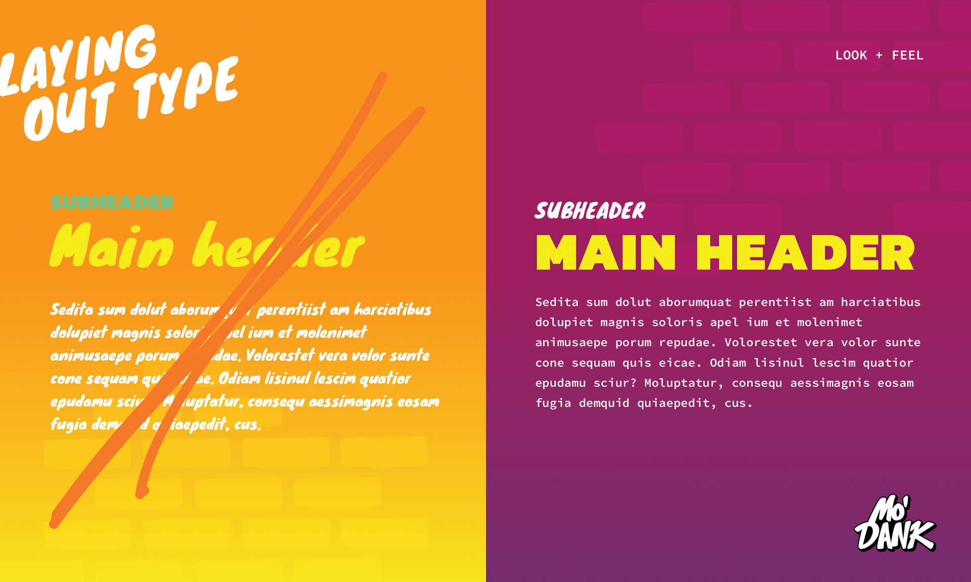
With this in mind, we used clear and concise language to establish brand positioning, promise, manifesto, and core messaging. We strategically created a vibrant color palette to match their personality and help distinguish between their strain types. A graffiti-style typeface was contrasted with one that’s clean and bold—mixing 90’s grunge with a professional twist. We created own-able design elements such as a subtle brick texture and a scribble. We also utilized angled text that overlaps and spills outside of images to create a sense of depth. Finally, we pulled everything into a cohesive brand book.

Typography
Mo’ Dank
than the Rest
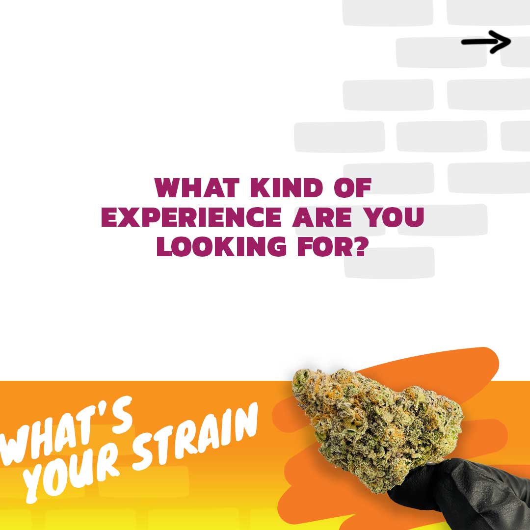
Utilizing the playful brand visuals, we designed their website to show off the high quality products Mo’ Dank is passionate about. We overlapped large, angled headlines with imagery and video to better connect one section to the next. This also created a sense of depth and added an edge to the design. We incorporated subtle animation like a parallax scroll and puffs of rolling smoke to bring the full experience to life.


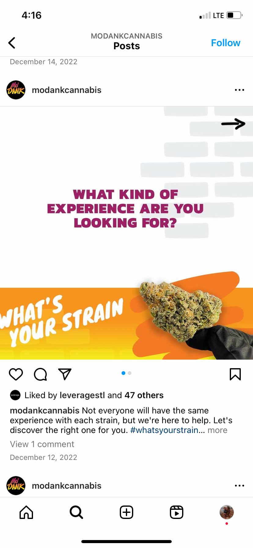
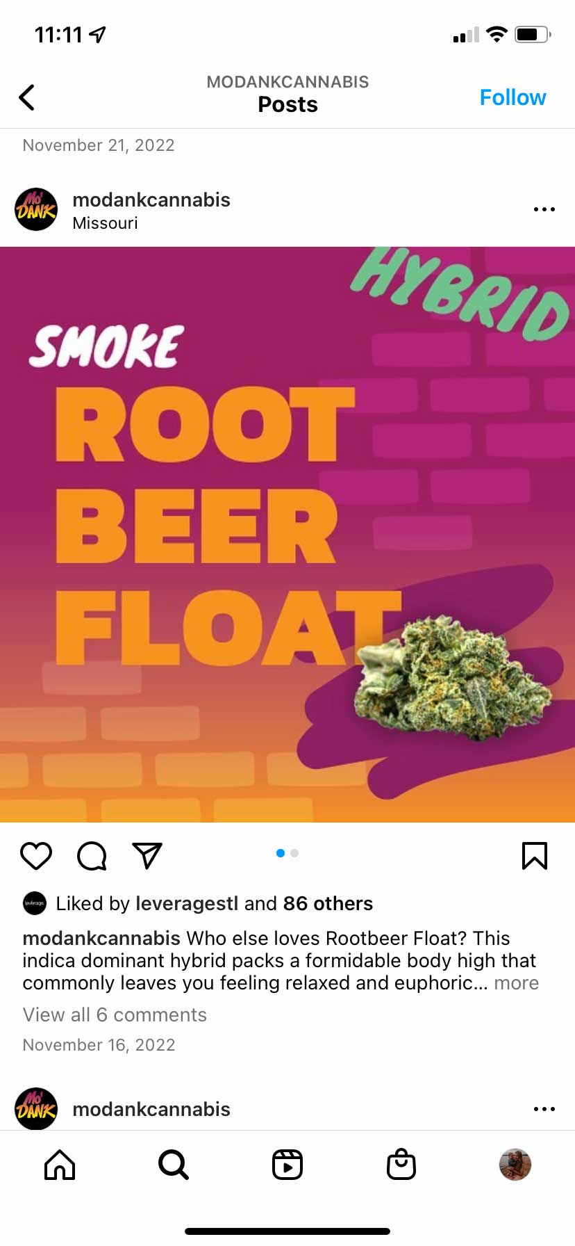
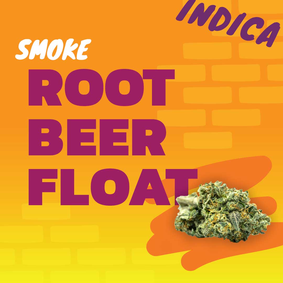
An Engaging Social Strategy
Similar to most brands, a big piece of Mo’ Dank’s marketing strategy is focused on social media. We partnered with them to develop a full social strategy with Instagram and Twitter as the primary channels. After conducting market and competitor research, we identified their core pillars that all of their content would relate to. We created a content calendar each month with post dates, captions, hashtags and creative direction, and provided them with easy-to-use templates that allows their creative to stay consistent and enables turnkey post execution.

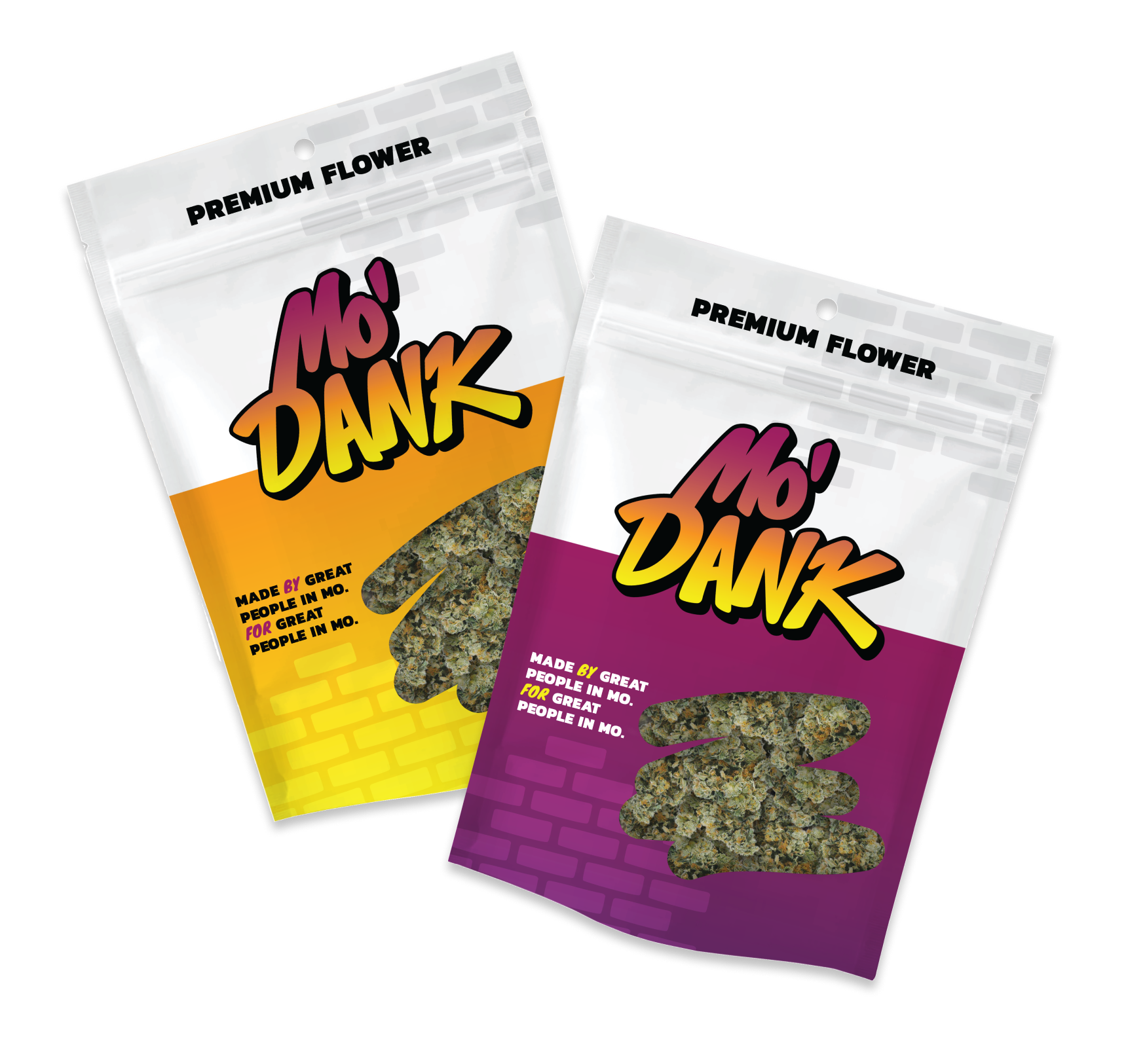

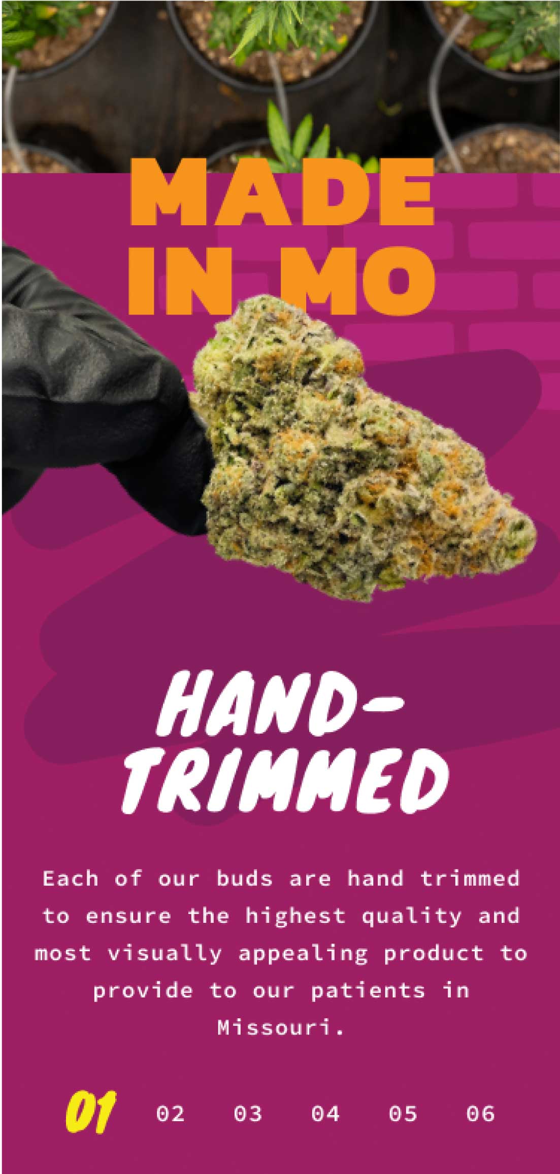
Premium Packaging Design
Part of executing Mo’ Dank’s new branding involved designing their product packaging. It needed to be attention-grabbing to stand out on a shelf among a sea of competitors, while also adhering to a long list of compliance regulations.
A large logo and large areas of vibrant color allowed the packaging to stand out. We relied on brandable colors to help distinguish between different products types.
The appearance of the cannabis flower is a big decision-maker for consumers when choosing their product. By incorporating a small window in their branded scribble shape, customers can view the quality flower, without letting in too much light.